- Year
- 2024
- Category
- Visual Identity
- Suradnik
Ana Bodrožić
- Klijent
Hauska&Partneri
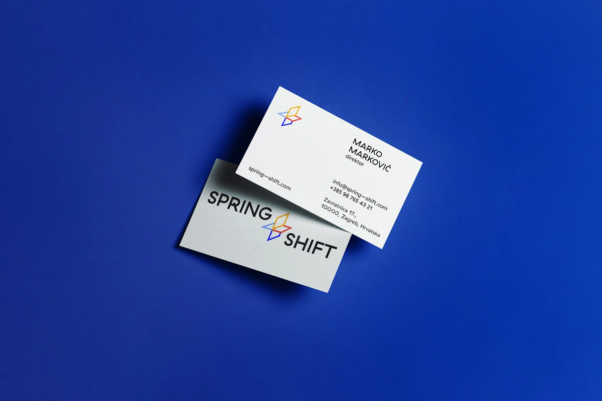
The plus symbol stands for connection while also signifying growth, progress and innovation. This simple yet strong sign mirrors the dynamic character of the Spring + Shift agency, which is focused on creating value through creative and strategic shifts. Its three-dimensional form highlights the interconnected services and ideas the agency offers, while leaving room for modular visual readings of the many values, activities and aspects that define its work. Every part of the agency can be expressed through variations in shape and color, making the logo flexible and adaptable to different contexts.
The logo creates a sense of depth by setting conceptual planes against one another within an orthogonal system. These planes are drawn with contour lines, which lend lightness, transparency and flexibility. This visual approach is in line with the agency's philosophy, which values adaptability and agility in business. The plus sign reads not as a fixed form but as a dynamic element that is always evolving. As modular units, the planes can be recombined in many ways, producing a visual interplay that stands for the expansion and growth of the agency's services.
A key part of this logo is its carefully chosen typography, which works in harmony with the design elements of the symbol. The typeface is modern, clear and minimal, yet has enough character to support a strong brand presence. Its sharp lines and soft curves express a balance between professionalism and creativity, the core values of the Spring + Shift agency.
The colors used to code the visual identity cover different aspects of the company, along with its vision and values. Each color carries particular qualities the agency wants to convey: Blue — stands for success, trust and stability. It suggests professionalism and excellence in service, both essential to client relationships.
Red — stands for motivation, energy and action. It signals a firm commitment to the work and evokes a sense of engagement.
Yellow —expresses enthusiasm and optimism. As a color that sparks energy, it reflects a proactive way of working with clients and a constant search for new opportunities to grow and develop.
Lavender — stands for creativity and innovation. It suggests freshness and originality.
Beyond its aesthetic appeal, this color palette strongly reflects the agency's mission to keep growing, to explore new possibilities and to offer solutions that drive change in the industries it works with.
2024
The logo creates a sense of depth by setting conceptual planes against one another within an orthogonal system. These planes are drawn with contour lines, which lend lightness, transparency and flexibility.