- Year
- 2024
- Category
- Visual Identity
- Kreativni tim
Karlo Kazinoti Mišo Komenda Ana Bodrožić Frane Balta Bruno Dubravec Hana Malenica
Public Competition Second prize in the HDD (Croatian Designers Association) competition for the visual identity of the Tourist Board of Split-Dalmatian County.
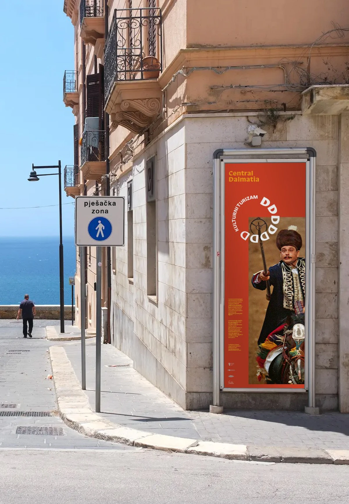
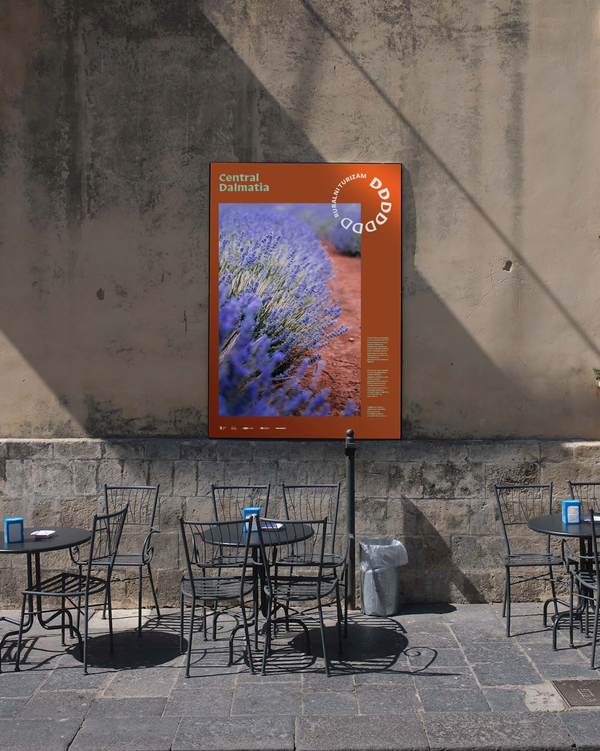
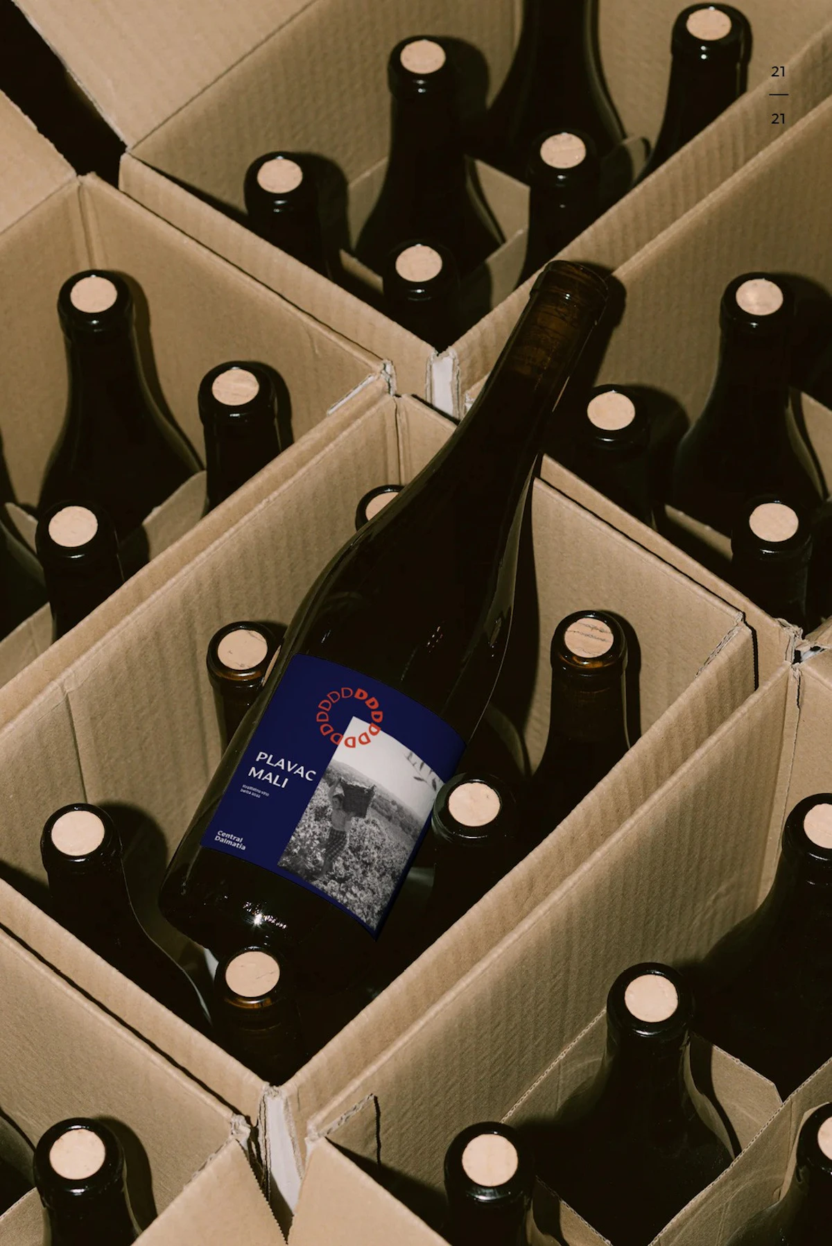
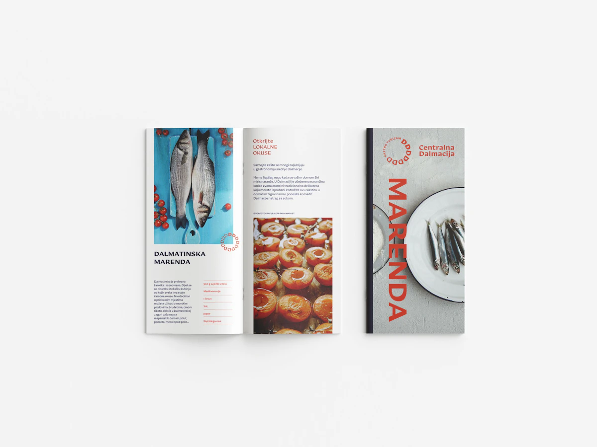
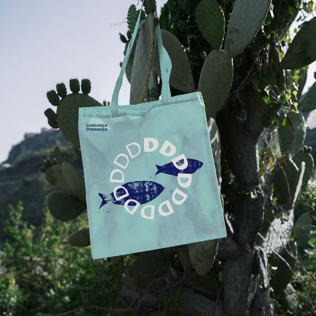
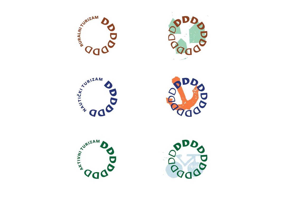
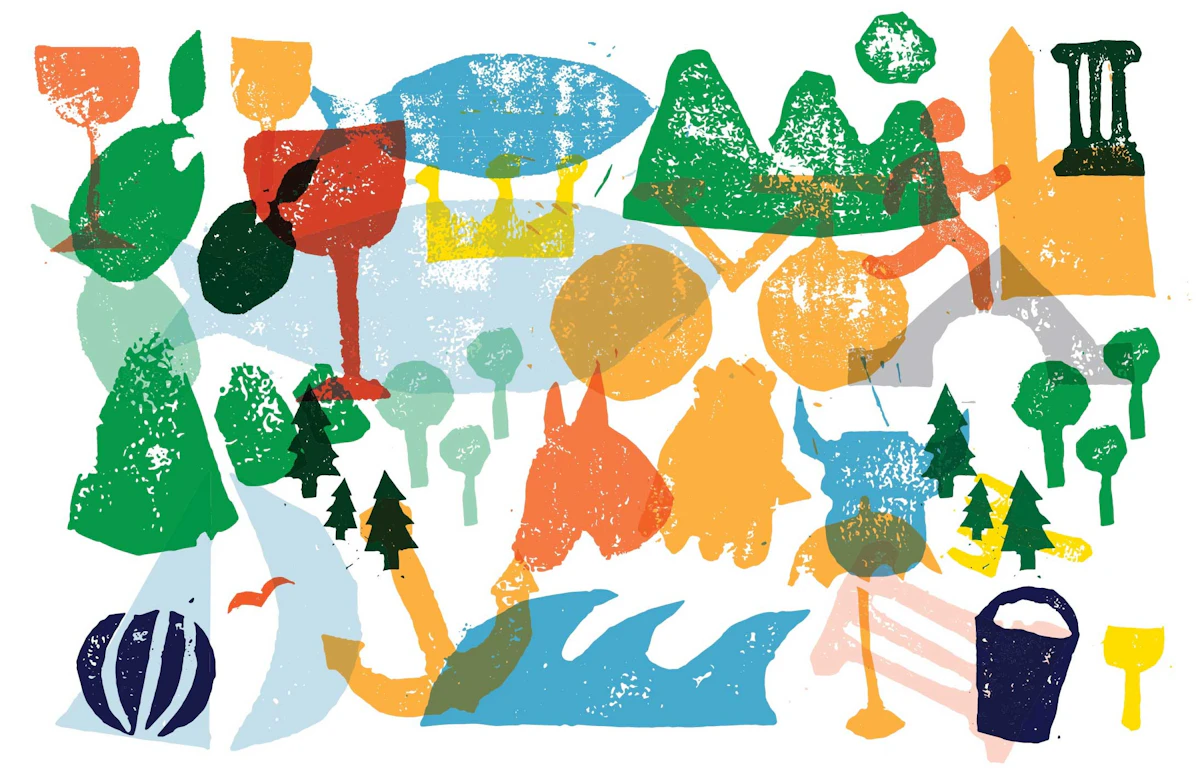
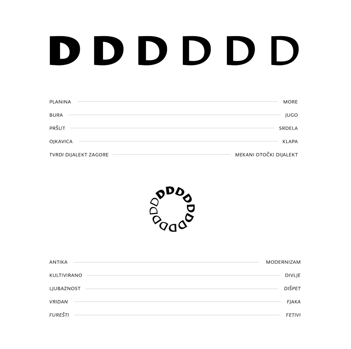
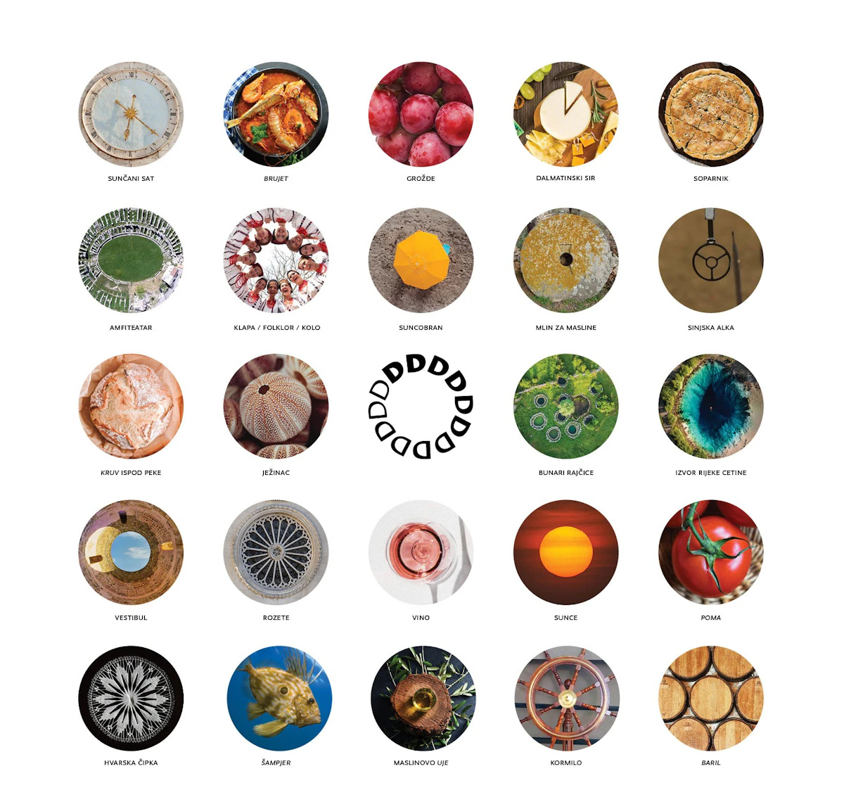
Concept / Harmony of Contrasts From the atonality of “Rera” and “Ojkanje” to the harmony of “Klapa” singing, Dalmatia is defined by strong contrasts and lively diversity. The idea reaches from geomorphology to culture, architecture and even eating habits. Since ancient times, life here has followed a circular, repeating rhythm, bathed in sunlight for most of the year. Out of these reflections on Dalmatia came a symbol that is at once whole and full of contrast. Repeating the initial "D" forms a circle that stands first and foremost for the sun, while also serving as a metaphor for the gentleness and harshness this part of Croatia holds at the same time. A contrasting sans-serif typeface carries the idea right down to the letterform from which the symbol is built. The gradual thickening of the letter stroke within the symbol reinforces it further. Through its structure, the symbol clearly expresses the playfulness and vitality of Dalmatia. The strategic aim of a balanced, year-round tourist offer is quietly built into a symbol made of 12 parts. These parts stand for seasonality, one of the biggest challenges facing tourism professionals. Geometric, stable elements and modern typefaces give the identity a contemporary look that does not bend to trends, ensuring it stays fresh and lasting. The form also holds great potential for use in dynamic, animated formats.
2024
Repeating the initial "D" forms a circle that stands first and foremost for the sun, while also serving as a metaphor for the gentleness and harshness this part of Croatia holds at the same time.